Holon Solutions
Role: UI/UX
Situation
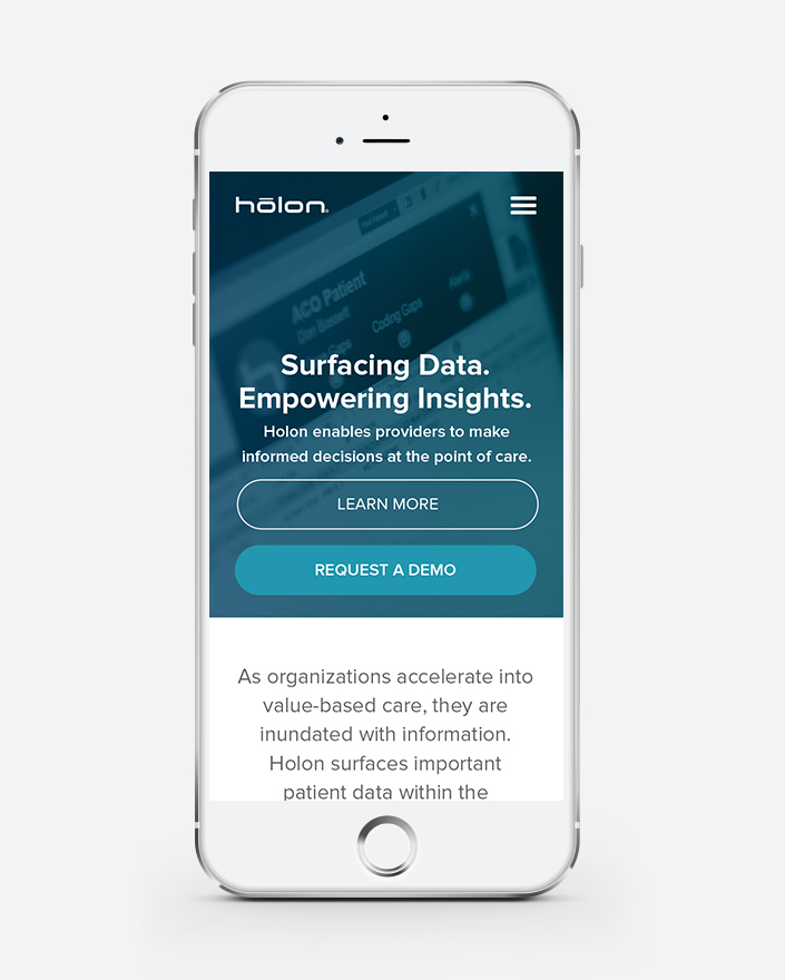
Holon is a healthcare information technology company that surfaces critical patient data within the provider’s workflow, so informed decisions can be made at the point of care. Our friends at Sage Growth Partners had already teed up development of Holon’s site, when they reached out to us for help with the interface design.
What We Did
Together with Sage Growth Partners we crafted a beautiful, responsive browsing experience for exiting customers and first time visitors. This was accomplished by creating a design that was breathable with purposeful use of white space and legible type. One of the main goals was to garner sign-up for the product demos of their platform. We achieved this by strategic CTA placement throughout the site.


